
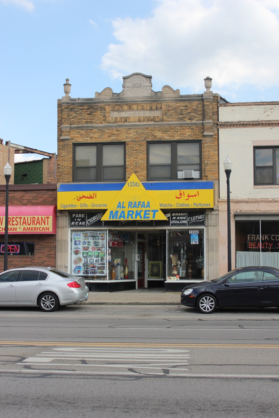
One of the things I often find myself paying attention to, whether I am here in Dearborn or visiting a new place, is the attention to detail that businesses put into signage and the design of storefronts or window displays. While for many people this may seem like a trivial element that doesn’t impact the core of a business – the food that is going to be served or the groceries about to be bought – to me the design of a facade is a passerby’s first impression. At best, a sign is a creative way to simply and directly translate to viewers what a business does and who it is targeting. The problem is that here in Dearborn (like many places, to be fair) many people are not attentive to the appearance of their storefronts. Our city has a strong base of small businesses, but when it comes to design and branding, the business community does not always meet the mark. Storefront’s can be sloppy, odd, or even difficult to look at. Even so, storefronts can always change and even the most minor effort can make a major difference in the quality of our streets and public spaces.
One of my biggest frustrations with storefronts in Dearborn, a trend that seems to have spread like wildfire, are the LED strip lights that are used to line windows. They are intensely lit with bright colors and look awfully cheap. While I understand the desire for a cheap alternative to neon in order to light up a storefront, in my opinion these make bad storefront’s look obnoxious, and on our more beautiful buildings they detract from the original design. I don’t mean to call out any particular business here, but Shatila is actually a pretty fantastic building, with a great sign and a great interior, but at some point they decided to line all of their windows with this cheap lighting. Sure, the building is a heck of a lot brighter, but it made what seemed like a relatively dignified building become a lot less beautiful. These small LED lights are intended to be used as backlighting an object, where the shape of the three dotted lights will not be visible, not to be put on display.
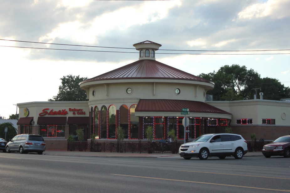
Shatila Bakery Window LED Lighting
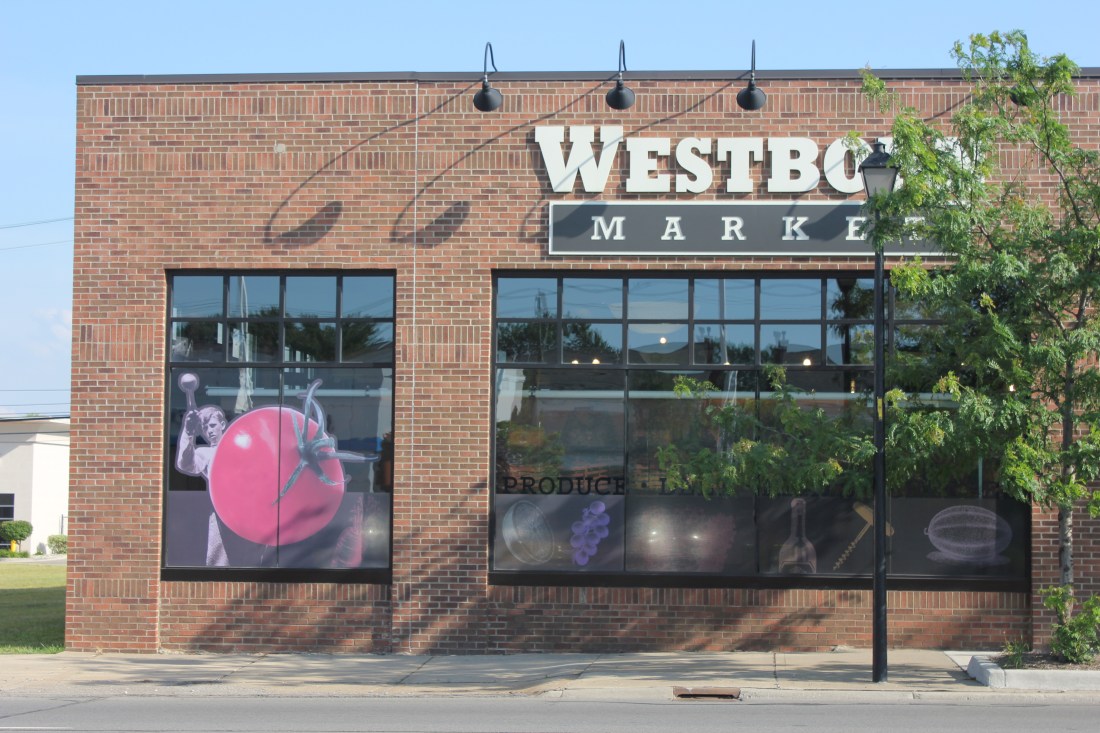
Another major issue are the full window stickers that are pretty frequent in the city. These include blown up pictures of produce, meat, groceries, or other products, and essentially serves as either a window covering or an advertisement. I am not against either of those things outright, but it is the way that it is implemented that makes all of the difference. For example, just compare the window coverings at Westborn Market and Greenland Supermarket. While Westborn has these creatively collaged graphics of old photographs of people and produce – designed to catch your eye and give you an idea of what the store has to offer – it seems like Greenland just used stock images of meat and produce plopped onto a wall taking up a major portion of warren avenue. When it comes to windows I generally think that seeing into a business or looking at a window display is best, but when a solution like this is necessary lets please opt for a well designed graphic and not stock photos.


When it comes to signage, sometimes the simpler the better. An attractive sign can be any number of things, but probably the two most important considerations are the font and logo. As someone who formally studied design at Wayne State, I have learned to really appreciate the visual impact of typography – the design of letters. Lighting or neon can also be important considerations, adding a fun or charming element, but the task does not have to be very complex. The art of storefront design seems to have progressively fallen out of fashion, and a quick flip through historical photos of any main street will immediately present to you a number of fantastic signs along quaint storefronts. I am not advocating any particular historical style be reproduced, but I do believe that in the past storefronts were designed more carefully. Part of the problem today is that technology makes creating your own sign so accessible that some entrepreneurs would rather take design into their own hands to save some money, rather than approach their visual brand as an important investment in their businesses success.

An old storefront in Hamtramck, Michigan
Not only does design impact a single business, but the overall feeling of a street is affected by the cumulative design choices made by a community. It can influence how people interact with the street: Does the street look like a place you would want to linger? is this a place I would come to study? Bring my kids for an afternoon walk? Would I come here on a date? This element of storefront design brings to play into what is known as “placemaking” and should be taken seriously with regards to quality of life and economic development. Locally, different organizations in Detroit have invested in facade improvement programs for just that reason, including the Detroit Economic Growth Corp Green Grocer Facade Program, the recently launched Motor City Re-Store facade improvement program, as well as other initiatives in Midtown and Southwest Detroit. A particularly interesting program is the City of Montréal’s Commerce Design Competition in which different existing businesses around the city pair up with local designers and compete to win best design. Not only does this program empower local businesses and improve their chances of success, but it also is aimed at bolstering Montreal’s creative economy, supporting graphic artists, architects, illustrators, and interior designers. I think that some sort of program to encourage and even possibly fund storefront renovations would be an excellent investment to make in Dearborn.

Awesome article. I am glad someone finally wrote about this. And the FONTS! And the LOGOS! What a design calamity! Being the founder of W Design and Development, many signs in Dearborn are an eye sore!
LikeLiked by 1 person