

When some clients tell me, “No I don’t need a logo. I can make one on Word in 5 minutes. It’s just a logo,” I try to keep calm. I am a calm person after all. But I’ve studied art and design. The sketchbook has been my best friend since I was five years old. I notice all the small details around me and how they affect our perception of art. In my drawings, paintings and designs, I focus on all the small details that help convey the message to the viewer indirectly, so it is not “just a logo!”
I am sorry I got carried away and didn’t introduce myself. My name is Julie. Art has been my passion since I was a kid and I mostly loved to draw. I have a Bachelor’s degree in arts, and a passion degree in learning new artistic things. (Yes, I totally made this up, but it’s true). I am the creative director at WDD, W Design and Development. We specialize in app development, website design, graphic design and online marketing. Part of what I do is branding companies. Although some companies don’t focus on that part, I think it is essential to create an identity for their business, starting from a logo, to business cards, to flyers, to a website and more. I usually start with the logo, as it is the face of the company.
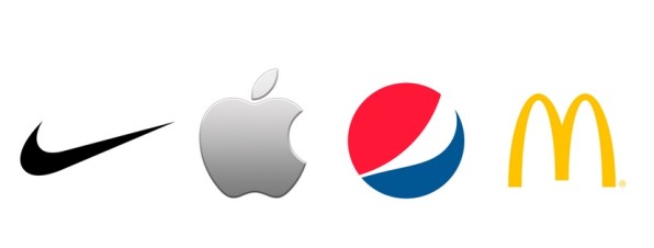
Take a look at the logos below. I bet you can name them all. Go ahead, do it.
That was quick. Impressive! Now let me tell you why you were able to name all the logos.
When a company, an organization or any business decides to have a logo designed for them, it is like putting a face to a name. A logo is designed to be distinguished and remembered. It is the company’s identity.
Now we see logos everywhere. Anyone can create one, but a well designed logo has so much thought, effort and time put into it. For a logo to be recognized anywhere, it should be timeless. It should not belong to an era or one art movement. Take for example the swoosh Nike logo that was adapted by the company in 1971. It is one of the most recognizable logos in the world for its cleanliness and simplicity.
The pepsi logo has been changed several times since it was first designed in 1898. Starting from a swirly font, the logo finally took a spherical look in 1943 in the shape of a cap with three colors only, blue, red and white. With time, Pepsi has changed the logo a few times, but only to make it simpler, cleaner and more attractive, so that anyone can recognize the logo of one of our favorite refreshing drinks. The logo has maintained its spherical shape and colors and it stayed recognizable. It kept its identity for the last 50+ years.


Excellent post.
LikeLiked by 1 person